
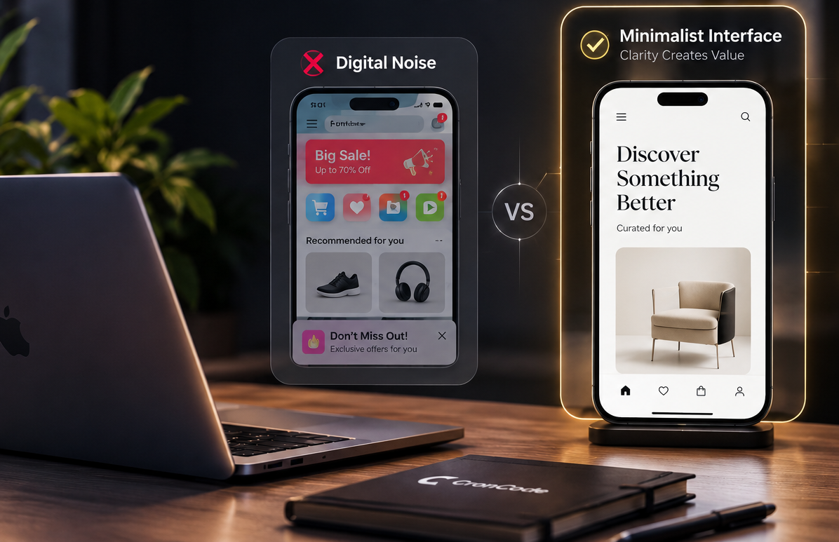
Reducing Digital Noise: Why Premium Brands Invest in Minimalist Interfaces
When you open a mobile app or web platform today, what is the first thing you encounter? Flashing notifications, aggressive pop-ups, menus crammed into every corner of the screen, and a riot of colors competing to steal the user’s attention… We call this “Digital Noise.”
Many companies assume that the more features and buttons they put on a screen, the richer the experience they provide. Yet, the world’s most valuable, premium brands (Apple, Tesla, Airbnb) invest heavily in the exact opposite direction: “minimalist interfaces.” So, in the digital world, why does “less” always yield “more”? Why do premium brands adopt avoiding clutter as a business strategy?
The Digital Equivalent of Luxury:
“White Space” When you enter a luxury shop, what is the first thing you notice? It is “space.” The goods are not stacked one on top of the other; they have their own space. This is illustrated in the digital world, where the abundance of “white space” is not just a blank region on the screen – it is an integral part of the design that keeps users concentrated on the information displayed. If there are not many elements on the screen, the elements that are present are of greater worth.
By Eliminating Decision Fatigue in accordance with Hick’s law, it is said that the increase in options correlates with the amount of time being taken to make a decision as time increases logarithmically with the increase in choices. Thus, leaving the user alone with a plethora of buttons and complex navigation results in making them tired of using the product. On the other hand, premium interfaces help the users out by working for them through structural symmetry. Excellent UI/UX design does not allow users to think about what they should do next..
Replacing Buttons With Sharp Typography
The key to creating an elegant user interface is to create a hierarchy by focusing more on the typography than on the colors. The use of a good typeface that is readable and rich in characters can help to convey the content in a different size and forms through which the information architecture can be understood. In this way users will be focused on the information rather than the colors.
The Philosophy of CronCode and its Luxury Impression At CronCode, we refuse to accept mediocrity in our digital products. Achieving a minimalist, clear, luxury impression—the so-called “Apple style”—is the main goal of our technology in every mobile and web app we create. We know that good design should not be evaluated by the number of things present on the screen but by the amount of things that can be removed from it. When the digital noise is eliminated, what is left is a perfect user experience.
